Summary
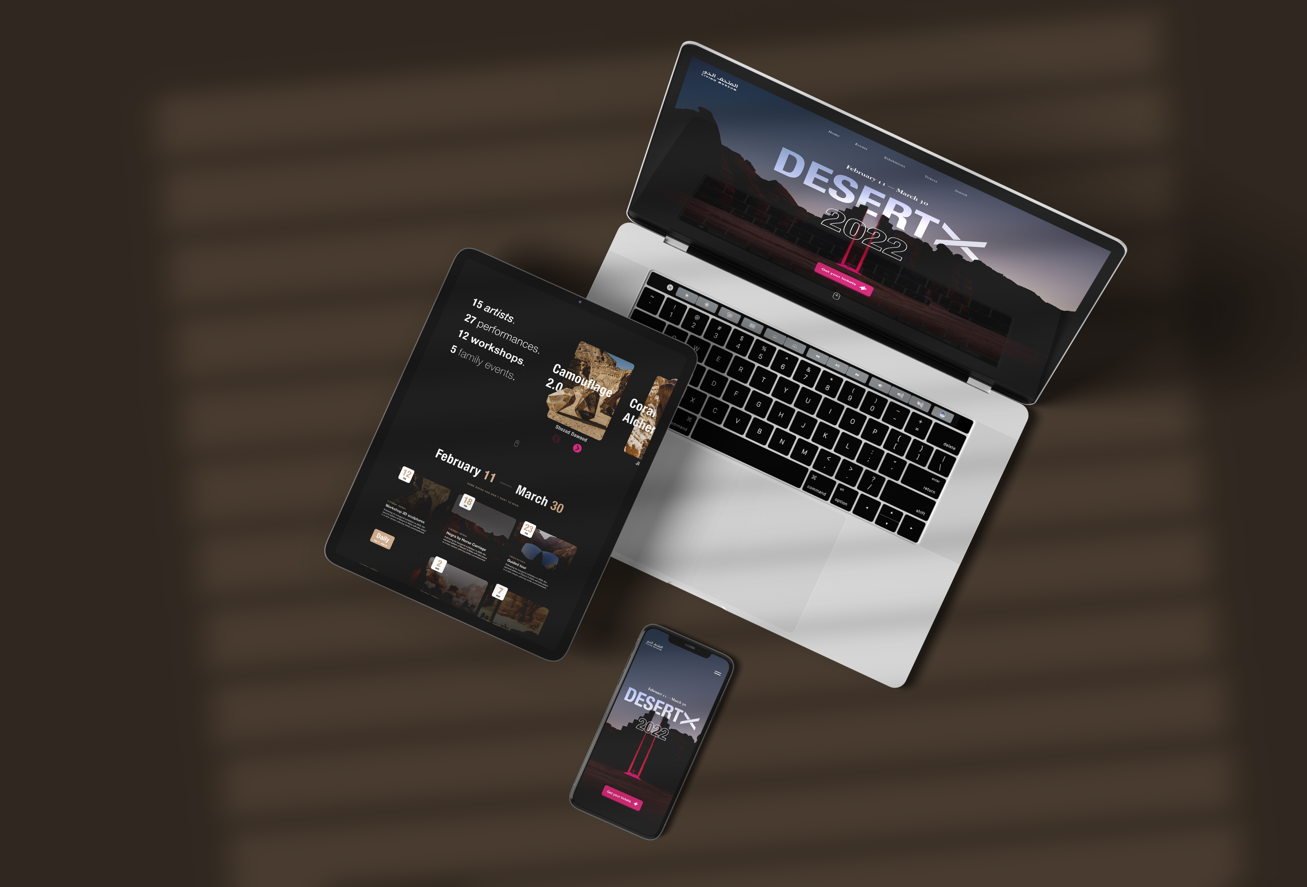
A small scoped project on a challenging timeline with limited hours. The Living Museum website (livingmuseum.com) has existed as an MVP for almost 2 years. After proven viability an iteration was required. The ask was to re-imagine the Desert X event as a standalone campaign for 2022. I identified a number of painpoints in the as-is before proposing a new design. Ideally, I would have started with some form of user research to gain a few key insights, however in this case I didn’t have the resources, so the more I needed to leverage proven principles and patterns. My personal objective was to take Desert X's online presence from viable to loveable.

Steps taken
- Scope definition (& potential risks);
- Expert review;
- Benchmark analysis;
- Patterns & Principles;
- Design deliverables.
Scope definition (& risks)
- In scope
- Out of scope
- Potential risks
Redesign of the Desert X event as a standalone campaign, solving existing painpoints and increase user value to increase engagement with the Living Museum brand.
A scaleable platform and navigational structure (missing in MVP) to facilitate other content- and pagetypes (e.g. deep art, nature & wildlife, and archaeology & heritage).
1. No tangible user insights. My advice was to validate with customers in a next increment.
2. Pressure cooker meant a limited divergent phase (fewer directions during design sprint)
Expert Review
It wasn't that hard identifying painpoints in the MVP. Most of the gains I would consider low hanging fruit. Which made the as-is not a good reference to iterate on. A list of painpoints:
- 1. No navigational structure
- 2. Unutulized screen estate
- 3. Doesn’t meet accessibility standards (e.g. insufficient contrast to read copy)
- 4. No visual hierarchy (e.g. 80/20)
- 5. No (clear) CTA’s
Benchmark analysis
To have a good frame of reference, I reviewed different online museum- and experience propositions that deliver a loveable experience. The following websites came out fitting the benchmark in terms of communicating the value proposition, good storytelling, making use of UX principles (e.g. 80-20 rule, chunking) and meeting accesibiity standards.
- www.v21artspace.com
- www.cosmos.network
- pad.dotincorp.com
- www.inspacewetrust.org
- www.searchablemuseum.com
Most of the used UX patterns I would consider the basics of good design, nothing stood out in particular - but in terms of UI there were definitely some new inspiring visual components. I purposely didn’t spend too much time however as I didn’t want to become biased and restrict green field thinking.

Patterns & principles
- 📊 UX
- 🖌️ UI
1. One pager (lower drop off rate)
A campaign on average is not a complex product, so we shouldn’t over complexify it with different flows and navigational routes as that just leads to potential drop off points. Next to a lower drop off, other reasons to use an onepager is the possibility for seamless storytelling and almost having one single interaction (scrolling) all the way through which eases the experience a lot.
2. The 80-20 rule
80% of attention is spent on 20% of the page. A common mistake I still see within many companies and product teams is not optimising their informational focus. There is a great scientific rule for this called the 80-20 rule (used within other industries as well). It’s a necessity to narrow down your focus to the essential cause, ideally above ‘the fold’. The essential information of this campaign should be above the fold. The proposition should be clear from the start or customers could drop off due to ambiguity. In this case the event name, dates and the main call to action (book tickets).
3. Chunking principle
The principle of chunking is to break down relevant information or content in to small, easy-to-digest pieces, making it easy and pleasant for customers to find there desired information. It’s a concept that has it’s roots in psychology. Actually many UX principles come from cognitive psychology.
4. Principles of Cialdini: Social proof
Cialdini was a professor of psychology and marketing who defined six principles for influence or persuasion which have proven themselves over last decades. So, looking at the objective of engaging more customers and getting people to book a ticket for Desert X, social proof seems like a very fitting principle.
5. Call to Action within thumb reach
There is has been a positive shift going on mobile - however still very often I see important CTA’s being put just outside of thumb reach - this while phone sizes are increasing to an average of 6 inches.
1. Used colours
Black [000], Taupe [CFAD8E] and Pink [D72E7F]. These colours on average evoke the emotions fitting the proposition. Black: Powerful, sophisticated, tranquility. Brown tones: Nature, Warmness, Earthy. Pink: Playful, energetic, associated with creativity, joyful, spirituality. Commands attention without being as overpowering as red. The latter is the reason I used pink and it's used for interactive components only.
2. Design as a metaphor
I like to use design as an extension of the proposition. In this case translating that unique blend of art and nature into our online presence. By intertwining copy and components with some of the Desert X content.


Informational segments
- 1. Landing
- 2. What is it?
- 3. Why should I care?
- 4. When is it?
- 5. Social proof
- 6. Footer
Next to the segments mentioned above, the main CTA (booking a ticket) is always there 'floating' within (thumb)reach. Obviously whenever a customer would click the call to action, it would start the out-of-scope e-commerce flow (should be simple flow in this case) including the right amount of push communication through the mail right after. My advice to the client was to keep iterating based on actual data of usage. This was a fun scoped project despite the pressure cooker.